Pie is the baked dessert of choice in summer, so we thought it fitting to offer a few simple tips for making effective pie charts. At Collective Results, we support organizations to communicate their impact using the most appropriate methods to highlight insights.
Pie charts should be used to represent parts of a whole, in this case the pieces of pie that would be eaten by the group at my summer backyard BBQ. This is the default pie chart that Excel created showing the groups’ preferred types of pie. It is not in an easily digestible format to interpret. Summer is meant to be simple and so are pie charts. Here’s a few quick tips to make your pie chart data easy-breezy simple to understand.
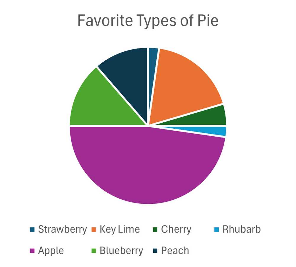
1.Compare only 3 to 5 categories.
If the main point can be captured with 5 categories, include the top 3 or 4 categories and group the remaining as “other”.
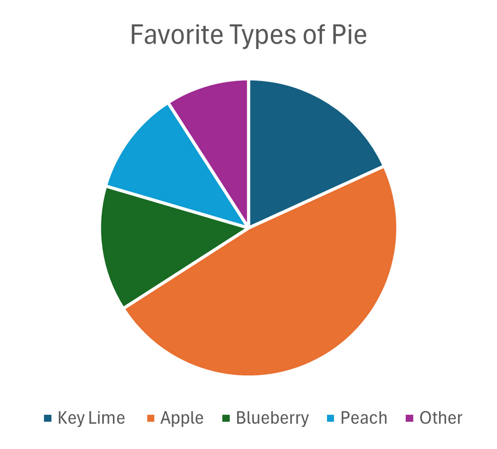
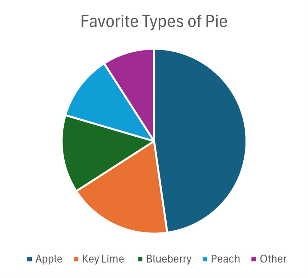
2.Start the largest slice at noon.
Angles are hard to compare. In Western culture, we are familiar with reading clocks starting at noon. Display pie sections in descending order clock-wise around the pie to make it easy to see which section is greatest to smallest without any guessing.
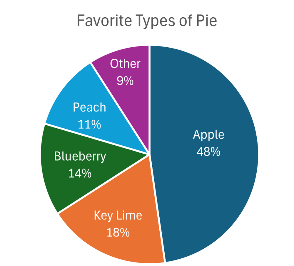
3.Label pie slices directly within the pie.
The reader’s eyes should not have to jump back and forth from a legend.
4.Use a title that offers interpretation.
Let’s make it simple for the audience to see the main take away message and sub-message.
5.Use color to represent the content of the chart.
This focuses attention on the key point of the chart.
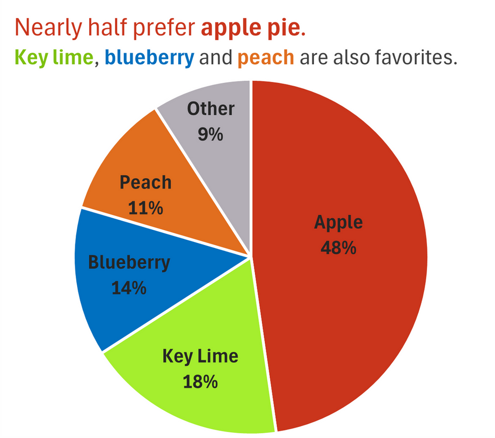
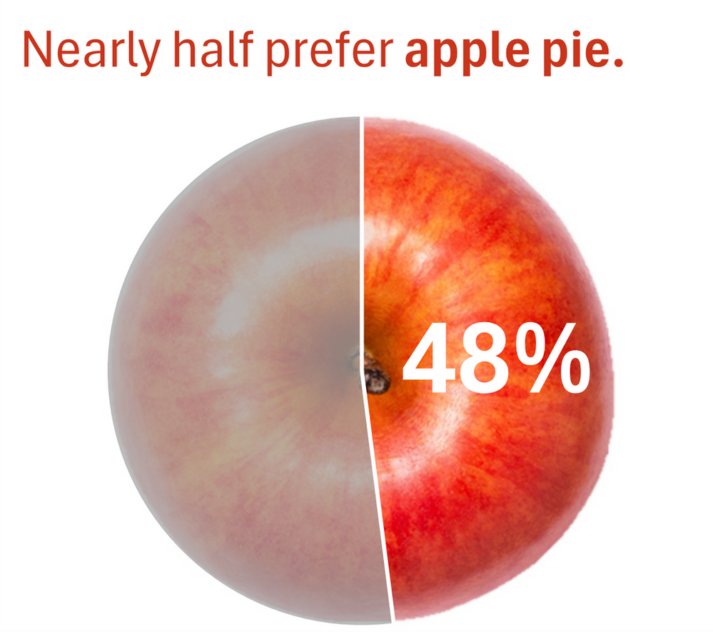
6.Use an image to highlight the main message.
If you prefer to just call out the main message, use an image or icon to give the reader a clue about the content before reading any words.
Resource:
Stephanie Evergreen is a great resource for tips on making simple charts.
